

Want to increase your chances of delivering on time? Teams that use visual tools like Gantt charts have a clearer view of deadlines, dependencies, and bottlenecks — and that clarity makes a difference. At Haile Solutions, we’ve seen firsthand how the right visualization can turn chaotic project timelines into clear roadmaps for success.
Have you ever tried explaining complex project timelines using just words or spreadsheets? It rarely works well. This is where Gantt charts come to the rescue.
What Is a Gantt Chart and Why Should You Care?
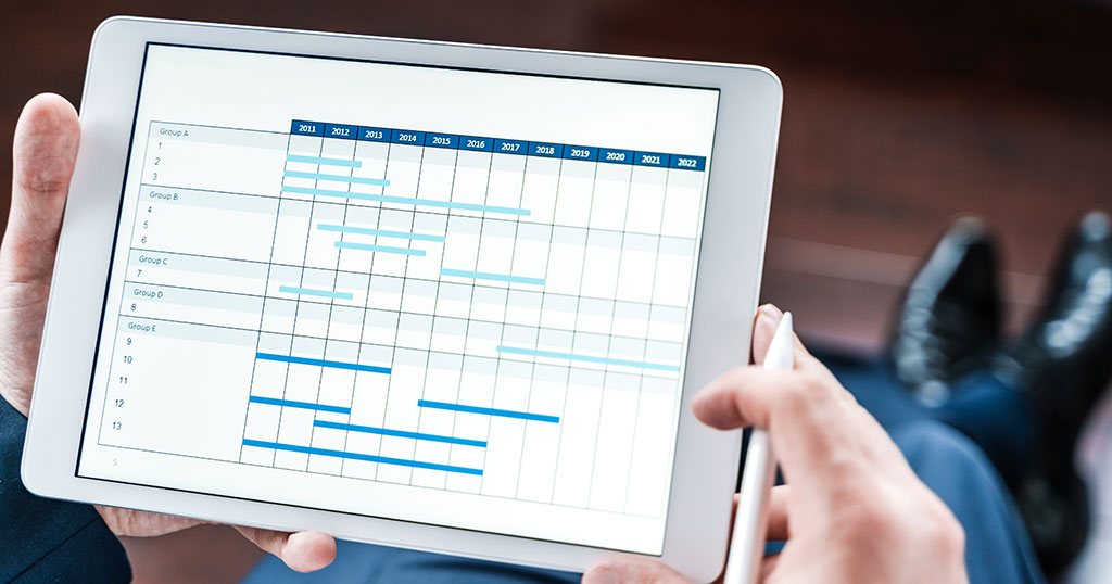
For those of you who don’t live and breathe project management, a Gantt chart is a horizontal bar chart that displays your project schedule over time. It shows tasks on the vertical axis and time intervals on the horizontal axis. Each task appears as a bar spanning from its start date to its end date.
But why should this matter to you?
Gantt charts transform abstract project plans into visual timelines that anyone can understand at a glance. They show not just when tasks happen, but how they relate to each other.
Here’s what makes Gantt charts essential for your projects:
- They show the entire project timeline in one view
- They highlight task dependencies and relationships
- They make it easy to track progress and identify delays
- They help manage team workloads and resource allocation
The Building Blocks of Effective Gantt Charts
Every useful Gantt chart contains four key elements:
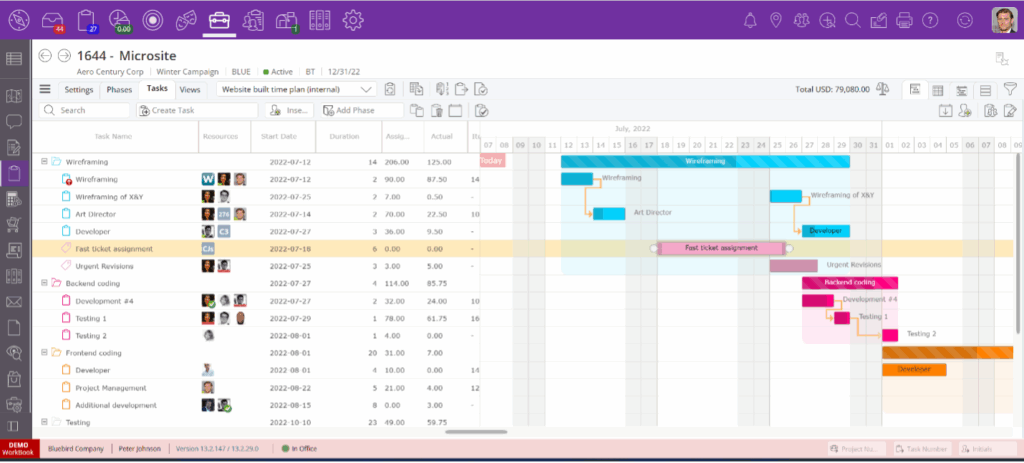
1. Task List
This is the backbone of your chart. It lists all project activities organized into logical groups or phases. We recommend breaking complex projects into manageable chunks to keep your Gantt chart readable.
2. Timeline
The horizontal axis represents your project timeframe. This might show days, weeks, or months, depending on your project length. For short projects, daily increments work best. For longer projects, weekly or monthly views prevent chart sprawl.
3. Task Bars
These horizontal bars visually represent each task’s duration. The length of each bar corresponds to how long that task will take. We often use color-coding to indicate different types of tasks, team assignments, or priority levels.
4. Dependencies
Lines or arrows connecting your task bars show which tasks must finish before others can begin. These relationships are crucial for realistic scheduling and preventing bottlenecks.
How to Create a Gantt Chart That Actually Works
We’ve guided hundreds of clients through creating effective Gantt charts. Here’s our proven process:
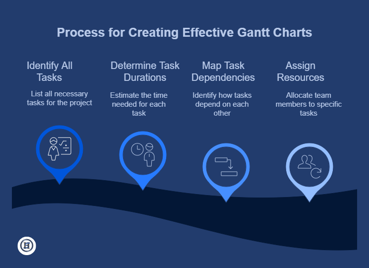
Step 1: Identify All Tasks
Start by listing everything that needs to happen in your project. Be specific and break larger tasks into smaller, manageable pieces.
For a website launch, don’t just write “design website” – break it down into “create wireframes,” “design homepage,” “design product pages,” etc.
Step 2: Determine Task Durations
For each task, estimate how long it will take to complete. Be realistic and include some buffer time for unexpected delays.
When we underestimate time requirements, the entire project schedule suffers. We recommend adding 20% buffer time to the initial estimate, although this is not a set rule. The buffer depends on the project risk. The higher the risk, the larger the buffer.
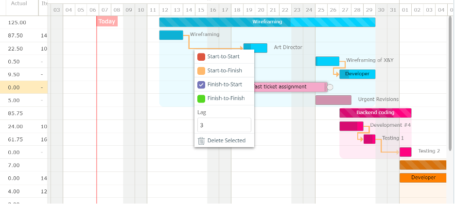
Step 3: Map Task Dependencies
This critical step identifies which tasks depend on others. There are several dependency types:
- Finish-to-Start: Task B can’t start until Task A finishes (most common)
- Start-to-Start: Task B can’t start until Task A starts
- Finish-to-Finish: Task B can’t finish until Task A finishes
Mapping these relationships creates a logical sequence of work and prevents scheduling conflicts. More importantly, they show the downward impact of changing a task duration or delay.
Step 4: Assign Resources
Connect team members or resources to each task. This helps everyone know their responsibilities and prevents overloading any individual.
We find that visualizing who is responsible for what drastically reduces confusion and improves accountability.
The Real Benefits of Using Gantt Charts
At Haile Solutions, we’ve seen these concrete benefits when clients adopt Gantt charts:
Clear Communication
Gantt charts speak a universal visual language. Clients, team members, and stakeholders can all understand project timelines without technical knowledge. This reduces misunderstandings and keeps everyone aligned.
Improved Planning
The process of creating a Gantt chart forces you to think through the entire project in detail. This upfront planning helps identify potential issues before they become problems.
One client discovered a critical dependency they had overlooked when creating their Gantt chart, potentially saving weeks of delays.
Better Resource Management
With a clear view of the project timeline, you can see who’s doing what and when. This makes it easier to distribute workloads evenly and identify potential resource bottlenecks.
Realistic Timelines
Visualizing task relationships helps create realistic project schedules. By seeing how tasks connect, you avoid the common mistake of overly optimistic timelines. We have been in plenty of meetings where the project manager has presented a draft Gantt chart based on a client’s input, only for the client to challenge it when it was visually represented. In other words, they quickly understood their own plan was unrealistic.
Progress Tracking
As your project unfolds, Gantt charts make it easy to track progress. You can quickly spot tasks behind schedule and take action before small delays become major issues. If you have properly set up the dependencies, you can also quickly see the impact of tasks behind schedule.
When Gantt Charts Work Best (And When They Don't)
Gantt charts shine in certain situations:
- Medium to large projects with multiple phases
- Projects with interdependent tasks and clear sequences
- Work requiring coordination between multiple team members
- Projects with defined deliverables and deadlines
However, they’re less helpful for:
- Very simple projects with few tasks
- Creative work with undefined timelines
- Highly unpredictable projects with constantly changing requirements
We’ve found that even in flexible environments, a simplified Gantt chart can provide valuable structure without imposing rigid constraints.
Practical Tips From Our Experience
We extensively use Gantt charts as part of our project management software so here are some practical tips if you want to do the same:
- Start simple and add detail as needed
- Review and update your chart regularly (we recommend weekly)
- Use color-coding to make information easier to process
- Include milestones to mark important points in the project
- Don’t try to include every tiny task – focus on key activities
The most successful project managers treat Gantt charts as living documents that evolve as projects progress.
Tools To Create Your Gantt Chart
You have several options for creating Gantt charts:
- Spreadsheet programs (Excel, Google Sheets)
- Simple project management software (TeamGantt, Microsoft Project)
- Online collaboration tools (Asana, Trello with Gantt view plugins)
- Full project Management software (Magnetic, Teamwork.com, Monday.com)
- ERP software specializing in project-based businesses (NetSuite, SAP Business byDesign, Deltek WorkBook, Odoo)
The best tool depends on your project complexity, team size, and collaboration needs. We often start with simpler tools and upgrade as projects grow more complex. In fact, the list above is ordered by complexity.
FAQ: Gantt Charts
How long is a piece of string? This depends on:
- The size of the project
- Project complexity
- A recurring vs an ad-hoc project
- Experience of the project manager
- The quality of Gantt chart software
For a small project, expect to spend 2-4 hours creating your initial Gantt chart. This investment pays off quickly through improved planning and communication.
Yes, with modifications. While traditional Gantt charts map entire projects upfront, for agile environments we create rolling Gantt charts that cover shorter periods (1-2 sprints) with more detail and longer periods with less detail. This provides structure while maintaining flexibility.
Creating overly detailed charts that become too cumbersome to maintain. We recommend focusing on key deliverables and milestones rather than trying to map every small task. A Gantt chart that’s rarely updated because it’s too complex quickly becomes outdated and loses its value.
Changes are inevitable in project management. When timeline shifts occur, we update the Gantt chart to show the impact across all dependent tasks. This visual representation helps everyone understand the consequences of changes and make informed decisions about how to adjust. Digital Gantt charts make these updates quick and painless.
Ready to Visualize Your Project Success?
Implementing Gantt charts doesn’t have to be complicated. Start with a simple version covering your key project phases and deadlines. As you get comfortable, add more detail where it provides value.
What’s your biggest project planning challenge right now? Could seeing it visually help you solve it?
At Haile Solutions, we help teams transform project confusion into clarity through effective visual planning tools like Gantt charts.